Infographic: The Environmental Impact Of Computing

I LOVE infographics! They beautify and clarify raw data — they're very compelling, visually appealing, they clearly present complex information and make facts and statistics easy to share and understand. Are you into infographics too?

It's amazing how even small changes to your daily lifestyle can have a huge impact on our planet. If you are planning to buy a new computer any time soon, please recycle your old hardware or consider donating it to your local school or public library, or find a worthwhile cause or charity in your area.

I've been a strong supporter of an eco-friendly lifestyle for a long time, and I've been recycling and re-using stuff for years. I think the first time I learned about recycling was in 1971 when I was just a young kid, and now it's just the way I do things. It's a good habit to get into in my opinion. It's really not too difficult and has a huge impact on the environment. Do you recycle?

Recycle, re-use or re-purpose: it just makes good sense!

Infographic: The Environmental Impact Of Computing

Here is the text contained in the infographic...

The Environmental Impact Of Computing


More than 285,000,000 new computers will be sold this year.


The manufacturing of these machines will require
→ 25 million tons of fossil fuels. More than the whole state of Iowa consumes in one year.
→ And 39 million gallons of water — enough to fill sixty-five Olympic swimming pools.

180,000,000 Old computers will be replaced...
→ 35 million will end up in landfills, along with their contents of lead, barium, chromium and other materials that disrupt the human central nervous system.

There are over 1 billion computers in use worldwide and that number is set to double by 2014.

Today, between the hours of 9:00 & 5:00 these computers will use 1.7 million megawatts of energy.
→ Enough to power Yankee Stadium for every home game until the 2596-2597 season.

An average PC monitor, when left on all the time consumes upwards of 1,100 kilowatt-hours each year. Over two times more energy than a new refrigerator.

The electricity used by the average desktop computer each day will produce roughly:
• 4-1/4 lbs. of CO2 the equivalent of adding 2 miles to your commute each day... or a road trip from Seattle to New York over the course of your computer's lifetime. If the screen brightness was reduced, this trip could be cut as short as Chicago.

Tonight, if all computers were shut down instead of being put in sleep mode they will save enough energy to light up the Eiffel Tower 24 hours a day for another 720 years.

Sources:


» Reuters.com, EnergySavers.gov, NYTimes.com, EnergyStar.org, Slate.com

This I am Green Infographic is brought to you courtesy of the fine folks at InfographicWorld. They specialize in the creation of viral infographics — both for your enjoyment, and for companies to help drive traffic and exposure to your website. Check out more of their work on the web at www.InfographicWorld.com. You can get their updates if you follow them on Twitter at @InfographicWrld. I do ;)


Out With The Old, In With The New Twitter!

Poccuagami by Chris Maier (click to follow @Poccuo)
I just logged into my @Peekr account to see what's new with Lil' Peekr and I was given the option to try the new Twitter... so I did, of course. I figured I'd grab a few screenshots for other folks that have not seen it yet and give folks a taste of what they might be missing (or think they're missing anyway). The screenshots below were taken while logged into Twitter using my @Peekr account via web as I was beginning to test the new UI with the @Peekr bookmarklet.

This Too Shall Pass, I Think?


Sadly, as I took a brief cursory look it seems like the new UI uses several different ID's which breaks the peekr bookmarklet version 2.0 — not the concept, just the current JavaScript. I'm thinking of possible fixes or a solution so stay tuned, but be forewarned I might not be able to fix it — and it's football and hockey season, so it may take a while if I even decide to bother with it.

Oddly enough, as I logged out and back in again with my other account it was actually comforting to use the old style Twitter web interface — which is still an option after you've tried the new one (at least for a while anyway). I've used so many Twitter clients over the years so it really doesn't matter much to me anyway.

Note that the full size screen captures are fairly large in terms of resolution and file size. Sorry. It's late, I'm tired, almost out of beer and I want to get this post done...

New Twitter Screenshots


Everything In One Place


Everything In One Place

Shortcuts


Shortcuts

TweetBox


TweetBox

Profile


Profile

Messages


Messages

Mentions


Mentions

Retweets


Retweets

Search for: 'backgrounds' With Links


Search for: 'backgrounds' With Links

Search for: 'backgrounds' People


Search for: 'backgrounds' People

Search for: 'backgrounds' People » More Info


Search for: 'backgrounds' People » More Info

Doh! Nope, it ain't really workin'...


Doh! Nope, it ain't really workin'...


Google Voice In Your Gmail Inbox (Screenshots)

Google Voice IconIf you haven't heard the news just yet, Google has rolled-out the ability to make Google Voice calls directly from your Gmail account (among other things).  I gave it a try and it looks more than just promising.  Why not get your geek on and check it out for yourself?  Or, check out the links and some screenshots below to get a better idea of what it's all about...

The rates are posted for international calls and they're competitive, if not insanely low.  Calls in the U.S. and Canada are free in 2010.

Get The Sauce From The Source


A Few Screen Scraps


Official Tweet Buttons In Action

Sharing is fun!

The Bell Curve Rings

 
I love to try new stuff and I'm definitely an early adopter in terms of new products and technology, art and design, and a host of other things. That said, I recently noticed a few posts on an "Official Tweet Button" which I initially thought was a rumor, then did a little surfing and found that — not only was it real, but it was already out in the wild!  

Crazy.  

It's tough to keep on top of things.  

Surf, read... share.  


Not Quite the Speed of Light, but...

 
The reason for my post on the topic is that I was amazed at how quickly things progressed. Yeah, rumors and blog posts about Twitter abound — it's ubiquitous — but this particular item struck me as unusually quick to come to life. I obviously understand that the typical web development cycle can and usually does take time, and I'm sure the process of designing and creating this new feature involved a team of people and plenty of thought, time and effort — but this one felt like it came to fruition at close to the speed of light.

Sharing is Sexy


I thought I'd add an example of the new Official Tweet Button in action because I think it'll really do well, I love to share stuff so I plan to use it a LOT and it's incredibly easy to implement (see the example at the bottom of this post). Adding it is cut-n-paste easy.

Here's an example of one super-simple method (there already are several ways to do it). Just add this to your code:

<script src="http://platform.twitter.com/widgets.js" type="text/javascript"></script>
<a href="http://twitter.com/share" class="twitter-share-button" title="Tweet it!">Tweet</a>


And you should get an Official Tweet Button like this:


...have fun sharing! Oh, and feel free to follow me on Twitter and tweet this post if you found it useful, why not? Sharing is caring ;-)


New Gmail enhancements

I'm the type of guy who almost always checks my email before doing anything else in the morning when I first sit-down in front of my computer. The only thing I do before this, of course, is make a fresh pot of coffee and pour myself a mug...

It's a ritual.

Historically Geeky


I've used Gmail as my primary mail client since it was first available in 2004, and it just keeps getting better. I love it's simplicity, and the way Google has been rolling new features into it over time rather than a big "upgrade" or "redesign" as I've witnessed and experienced in other products.

Gmail logo icon by Sephiroth6779I like the subtle changes and there's a feeling of 'delight' that this type of staggered (i.e.: Agile) feature roll out approach offers for the user. It also makes it possible for the developers to really focus on the implementation and get feedback early and often to squash any bugs and resolve any unforeseen front-end glitches more effectively as well. With this approach, everybody wins.

It's Delightful & Delicious


Today I had a pleasant surprise when I noticed some minor, yet really nice improvements in the way that Gmail presents their Tool-tip (a.k.a.: "HoverCard" information). These are admittedly not Earth-shattering changes, but they were a nice surprise nonetheless, so I thought I'd blog about it to see if other folks are also seeing these changes in their Gmail client.

Hover Info; Chat Column


Small screenshot #1 from Gmail; Click for larger image »The presentation of info is much better when you hover over a user's name in the chat column — much cleaner and more like a business card where the order of elements is better organized, and the buttons are placed on the bottom of the card. I really like this because the structure makes more sense, and it feels more natural to me.


Hover Over Sender Info


Small screenshot #2 from Gmail; Click for larger image »The other improvement I noticed isn't a huge change, but it is better in my opinion. When you hover over the sender's name you get the same presentation, treatment and structure as you do with the user's name. Same look, same feel, same structure: buttons on the bottom. I'm a big fan of consistency and this is also important in terms of usability.

If you're not using Gmail, I suggest you take a look at it and consider doing so. If you are using Gmail already, then I also think it's a good idea to check the Google Labs section every now and then or subscribe to the Official Gmail Blog RSS feed to find out if there's anything new you might want to try.


Cool: MouseGlove | Next-gen mouse

MouseGlove

Not your average input device; this interesting open source project aims to make human-computer interaction easier.


MouseGlove is an open source project for a new generation of mouse. The goal of this project is to provide an open source hardware and software stimulating new developers to improve the usability of computers through new interfaces.

MouseGlove is a new kind of interface born for helping people affected by disabilities who cannot use common interfaces such as mouse and keyboard. MouseGlobe offers a natural way to move the screen pointer, click and drag objects. Each action is natural as using your hands to keep, move and touch real objects on a desktop.

http://mouseglove.sourceforge.net/

Posted via web from ptamaro | posterous


Beyond Sight: An Experiment, Tribute and Celebration of the Inspiring Lives of the Visually Impaired.

Summary


Beyond Sight is a documentary following the everyday lives of some incredible visually-impaired individuals.

The Purpose


Blindness and visual impairments in the media have often been portrayed as something negative, a handicap, something to be feared. This movie is going to be different - amazing accomplishments and incredible lives, which would be amazing whether or not the individuals are blind. So, we are portraying visual impairments in a positive light! These stories deserve to be told.

The Project


http://kck.st/bliYvz

Still Haven't Found What You're Lookin' For?

Magnifying glass

Try these Social Media search engines, and if nothing else — I think you'll definitely find that you like 'em.


I surf a lot, and I do a fair amount of the Social Media stuff as well. Oftentimes, I find it difficult to get at specific bits of niche oriented information using the big engines — even with well crafted 'advanced search' criteria. This is especially true when trying to track real-time topics, unusual terms, odd trends and memes. Have you encountered this, or ever felt this way? Have you gone through multiple pages of search results on well-known search engines without finding what you were looking for — or even anything remotely close?

Recently, I've stumbled upon (or folks have shared with me on my Twitter account, @ptamaro) some really cool and powerful Social Media real-time search engines I thought I'd share with you. Below are some really cool social oriented search tools with features that go beyond what you'll see on the big engines. Although these tools are relatively new to me, I think I've seen enough to feel like they're going to help me to be more productive as I continue to use them and become more familiar with their specific features.

If you think I'm totally missing "a killer social search app" that you think should be included here, let me know. I'm always on the lookout for the next best thing...

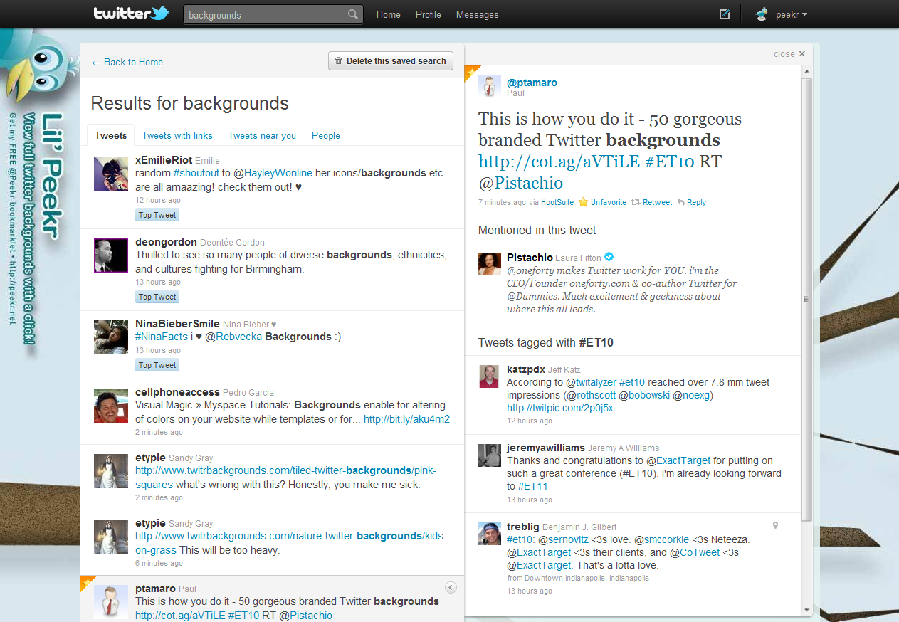
I'll highlight three very cool and ultra powerful social media oriented search engines. I strongly encourage you try them all, and see what you think. This isn't intended to be an extensive analysis, but rather a somewhat cursory look at a few of the lesser known tools available to help you find the things you're looking for, and maybe some interesting little surprises along the way. The search terms I used were "backgrounds" and "fibonacci".


Check out socialmention* Real-time social media search and analysis »

socialmention* Real-time social media search and analysis


@socialmention


This is an ultra cool and incredibly powerful social media search tool. The interface is beautiful, inviting, sophisticated and very slick. It's usability is fantastic and extremely intuitive. You can perform your search within more than eleven categories, and across more than 80 social networks and sources. It feels like a "social media über search" for lack of a better description — in their words, it's "a real time search platform" so it's a little bit more than an engine or tool.

It was tough to find anything that could be improved here. I guess it would be nice to have the source selection checkboxes grouped in a more logical way? For instance, the sources are listed in columns and alphabetized from left to right which seems awkward to me. Maybe it's just me. Nonetheless, it's hard to find any flaws which is unusual! This is how social search should be done. Period.

  • Comprehensive list of networks and services

  • Social Mention Alerts

  • Aggregated trend data

  • Single stream of real-time data available via API

  • A series of tools and widgets: Realtime Buzz Widget, Browser Search Plugin, iGoogle Gadget (coming soon)

  • Data-rich real-time results with analysis ratings and filters, hover tips, sorting, top keywords and hashtags

  • Export CSV/Excel, RSS feeds

  • Much, much more...


Check out WhosTalkin? Social Media Search Tool »

WhosTalkin? Social Media Search Tool


@whostalkin


This is a very unique engine with one of the most elegant and intuitive interfaces I've seen in a while. If I had only one word to describe it, that word would be: amazing. This engine allows you to run your search across more than 50+ sources within multiple categories.

The few shortcomings I noticed could easily be fixed. For example, there are way too many "back to top" links and that space could be replaced by something useful. Also, it's not entirely clear what source the results you're looking at are from — which can be a problem if you're quickly running searches across multiple social networks. This too can be easily fixed by displaying the category and network the results you're currently presented with are from. For instance, the content description at the top of the results could read, "Results for fibonacci' within: Blogs » Twitter" so the user would know exactly what they are looking at. A few more well thought out features may just be the icing this cake needs. That said, it's still awesome because of it's overall solid positive user experience.

  • Left navigation accordion allows you to quickly run searches through multiple categories and networks

  • Very intuitive user interface and it's really fun to use

  • They offer an iGoogle Gadget, and an API

  • Results are a bit basic in terms of the richness of data

  • Feels like it could use a few more features


Check out IceRocket real-time search »

IceRocket real-time search


@icerocket


This is a really powerful engine... and I think it's been around for a while. I've found some really juicy stuff using it. I really like it. I think the only downside of this engine is a slightly inconsistent user interface across screens which is a bit jarring.

This is a very cool data-rich engine with some unusually powerful features. A few tweaks to the layout consistency would go a long way — but these minor shortcomings are far outweighed by the overall value it provides.

  • Search by category; for example a social network (Twitter, MySpace), content type (video, images), blogs, news, the web, or the "big buzz"

  • Easily run the same search multiple times within each category with a simple click

  • Follow trends, submit your blog and use other tools like RSS Builder, Blog Tracker, or their API

  • When searching Twitter you have the opportunity to reply to or re-tweet directly from the search results, the results are updated real-time as more become available

  • You can easily save your search and run it again later, and alerts are in the works

  • Lots of information about the data you're looking at


I have a few more engines in the toolbox, but they take a slightly different approach and seem to be in another category altogether, so maybe I'll do another post since this one was a lot of fun. Comments and suggestions are welcome, and feel free to tweet me any time with your thoughts. What's your favorite social engine?