Showing posts with label ui. Show all posts

Out With The Old, In With The New Twitter!

Poccuagami by Chris Maier (click to follow @Poccuo)
I just logged into my @Peekr account to see what's new with Lil' Peekr and I was given the option to try the new Twitter... so I did, of course. I figured I'd grab a few screenshots for other folks that have not seen it yet and give folks a taste of what they might be missing (or think they're missing anyway). The screenshots below were taken while logged into Twitter using my @Peekr account via web as I was beginning to test the new UI with the @Peekr bookmarklet.

This Too Shall Pass, I Think?


Sadly, as I took a brief cursory look it seems like the new UI uses several different ID's which breaks the peekr bookmarklet version 2.0 — not the concept, just the current JavaScript. I'm thinking of possible fixes or a solution so stay tuned, but be forewarned I might not be able to fix it — and it's football and hockey season, so it may take a while if I even decide to bother with it.

Oddly enough, as I logged out and back in again with my other account it was actually comforting to use the old style Twitter web interface — which is still an option after you've tried the new one (at least for a while anyway). I've used so many Twitter clients over the years so it really doesn't matter much to me anyway.

Note that the full size screen captures are fairly large in terms of resolution and file size. Sorry. It's late, I'm tired, almost out of beer and I want to get this post done...

New Twitter Screenshots


Everything In One Place


Everything In One Place

Shortcuts


Shortcuts

TweetBox


TweetBox

Profile


Profile

Messages


Messages

Mentions


Mentions

Retweets


Retweets

Search for: 'backgrounds' With Links


Search for: 'backgrounds' With Links

Search for: 'backgrounds' People


Search for: 'backgrounds' People

Search for: 'backgrounds' People » More Info
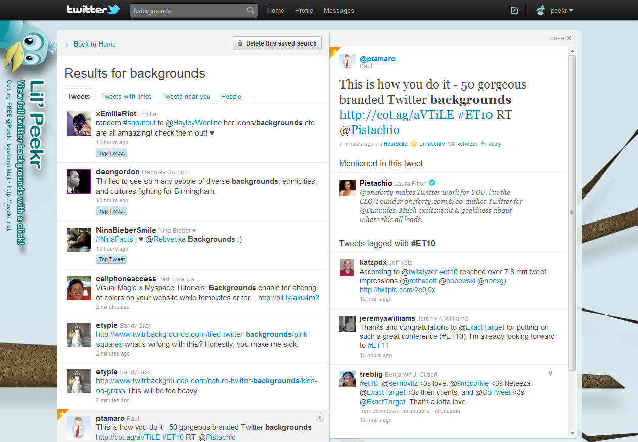

Search for: 'backgrounds' People » More Info

Doh! Nope, it ain't really workin'...


Doh! Nope, it ain't really workin'...


New Gmail enhancements

I'm the type of guy who almost always checks my email before doing anything else in the morning when I first sit-down in front of my computer. The only thing I do before this, of course, is make a fresh pot of coffee and pour myself a mug...

It's a ritual.

Historically Geeky


I've used Gmail as my primary mail client since it was first available in 2004, and it just keeps getting better. I love it's simplicity, and the way Google has been rolling new features into it over time rather than a big "upgrade" or "redesign" as I've witnessed and experienced in other products.

Gmail logo icon by Sephiroth6779I like the subtle changes and there's a feeling of 'delight' that this type of staggered (i.e.: Agile) feature roll out approach offers for the user. It also makes it possible for the developers to really focus on the implementation and get feedback early and often to squash any bugs and resolve any unforeseen front-end glitches more effectively as well. With this approach, everybody wins.

It's Delightful & Delicious


Today I had a pleasant surprise when I noticed some minor, yet really nice improvements in the way that Gmail presents their Tool-tip (a.k.a.: "HoverCard" information). These are admittedly not Earth-shattering changes, but they were a nice surprise nonetheless, so I thought I'd blog about it to see if other folks are also seeing these changes in their Gmail client.

Hover Info; Chat Column


Small screenshot #1 from Gmail; Click for larger image »The presentation of info is much better when you hover over a user's name in the chat column — much cleaner and more like a business card where the order of elements is better organized, and the buttons are placed on the bottom of the card. I really like this because the structure makes more sense, and it feels more natural to me.


Hover Over Sender Info


Small screenshot #2 from Gmail; Click for larger image »The other improvement I noticed isn't a huge change, but it is better in my opinion. When you hover over the sender's name you get the same presentation, treatment and structure as you do with the user's name. Same look, same feel, same structure: buttons on the bottom. I'm a big fan of consistency and this is also important in terms of usability.

If you're not using Gmail, I suggest you take a look at it and consider doing so. If you are using Gmail already, then I also think it's a good idea to check the Google Labs section every now and then or subscribe to the Official Gmail Blog RSS feed to find out if there's anything new you might want to try.


Size Matters: Methodologie Web Canvas

Methodologie is kind enough to share their 'Web Canvas' with all of us in the design community. Their Web Canvas is a grid that displays screen resolutions and the percentage of users that are capable of viewing the different screen resolutions. Their statistics are fresh (August, 2009) and based on numbers from http://thecounter.com and http://marketshare.hitslink.com

I've added this little gem to my delicious bookmarks... I think it'll be a helpful little tool when starting new projects or when I'm wrestling over what screen resolution to design for. All of this info and our own design experience seem to support the notion that in many cases size matters ;-)


Here's the link to the Methodologie Web Canvas...

Posted via web from ptamaro | posterous

Boxes and Arrows gets even better

It's new and improved! Are you a web designer? Then read give B&A a visit...
I guess it's been a little while since I've hit B&A, so I was psyched to see they've launched a new redesign. The new Boxes and Arrows UI is fresh, "clean", and compelling. I'm diggin' the orange and gray color scheme! Great job folks... =>I don't love the lack of link color or missing underlines for article titles in the "Previously" section on the Home Page, but that's not a big deal and really a minor detail. Give 'em a visit and see for yourself at www.boxesandarrows.com. I think they've always had really juicy topical, timely and poignant content as well. This new UI design reflects their level of quality content, depth of knowledge, and an earned leadership role in the industry. Top notch.

My only problem is that I just don't seem to have enough time to absorb and soak all the delicious goodness they've brought to the table, but here's one (or several) article that caught my eye...

Where's the "fold" you keep talkin' about?
Personally, I have felt for a long time that there is no fold in web design, period. Show me how to fold this CRT, or my panel and then I'll change my mind. origamiHere's my point: Don't let misguided ideas about "folds" determine all of your design decisions. Compelling content eliminates scrolling problems. Don't force 'em, just persuade them! Let's leave the folding stuff to those who practice origami.

* Post abstract: is here
    * Full article: Blasting the Myth of the Fold

Browser Bruises Really Hurt...


Wow, I have been using Opera 9.x more frequently for the last week or so -- it's an amazingly powerful browser -- but, goodness grief it's amazing how quickly the User Experience can degrade!

Yes, IE6 is broken, and Firefox 2.x can be a challenge but using Opera is a real eye-opener. Give Safari a whirl on Mac and it gets even better...

It's important to design with all of these issues in mind from the outset, and attempt to deliver a positive User Experience for all. It's far more important for the user to have a positive experience than for everyone to have an identical one.

Much of the creamy goodness of Web 2.0 just doesn't seem to work as it's supposed to in Opera. It's a real eye-opener indeed. These days, a small percentage of your customer base can actually be a large number of people, so it's hard to just write it off as "1 percent of our visitors" when that number can represent thousands or even millions of users or potential customers. I believe the term is "micro-niche" and folks have built very successful products and services just by attending to these 'small' niche markets.

The problem for developers is that customers tend to attribute a "less-than-optimal" user experience with the products, services, and companies that deliver them -- rather than technical limitations, or some other related factor. Budgets and deadlines don't necessarily account for this, and it quickly becomes a lose, lose, lose situation for all involved (i.e.: customer, designer/developer, product/service). Even worse, it's difficult to rectify or fix a bad User Experience after the fact.

Here are some examples... When I Drop a site into my Plum, I have to do it more than once -- even after logging in to my Plum account for that session. I also wind up with a bunch of windows that don't seem to relate to the Drop and things get messy quickly. Even worse, I could not even log in to my Blogger account to create this post in Opera because the login form didn't even show up!

What ever happened to the idea of graceful degradation for browsers that don't work the way things have been designed? Are we missing opportunities by just counting numbers when we segment off and alienate portions of our customer base because of technical limitations or design oversight? I think it's something like seven times more expensive to get a new customer than it is to keep an existing one happy.

Got thoughts? Got a pulse?

It's ALL about the USER, right?

I just stumbled across an interesting article (Yahoo! News) that seems to focus on the issue of the importance of UX (User Experience) and customer satisfaction. Take a gander at the article and see what you think...

> > > Yahoo edges Google in user satisfaction survey

The article is proof-positive that these days attending to the user experience is critical to product success and user adoption. User satisfaction and a positive user experience can separate your product from it's competition, give you immediate as well as long-term advantages in the race towards success, and build a strong foundation for customer loyalty.

I use both Yahoo! and Google's products, and I feel there are benefits to both. I am loyal to, and use both both of them daily -- but for different reasons. Which is better? For me it depends on what you're trying to achieve. I think Google's better from the stand-point that they have a "suite of tools" that work together well. I can get a lot done in a short amount of time using my "Google apps". Whereas, I prefer the look and feel of Yahoo!'s email client, but the general process-flows are kludgey and tend to drag because of their onslaught of advertising. Both Yahoo! and Google tools tend to pop me into far too many windows. Google's got a far better account creation flow, and the process is simple, painless -- and it works. Yahoo!'s account creation can be painful. I recently tried to help my daughter set-up a Flickr account (owned by Yahoo!) so we could share photos, but we were left scratching our heads trying to figure out why we weren't able to do so (we kept getting errors), and we were left with a less-than-optimal user experience.

It's becoming increasingly clear that a positive user experience can be an obvious differentiator when traveling the road to product adoption and long-term success. Customer satisfaction can also have a direct effect on the bottom-line.

Ultimately, it's all about the user. What are your thoughts?

Sweet interface, sour functionality?

What's up with Yahoo!'s video UI?


The new Yahoo! mail interface is sweet, but the news video interface leaves me with mixed feelings. The controls have a nice slick and sophisticated look (form is good), but it just doesn't work in Firefox 2. The picture is cropped on the bottom, the "pause" video control buttons do not function. It's slow and chunky-clunky... makes you not want to use it.

All that aside, here's a great video news clip of a great new product: A Personal Mini-Submarine. Can you get it in yellow?


>>> WATCH: Your Own Personal Mini-Submarine
(AP) Small enough to fit on a trailer, this mini-sub can dive 160 feet and packs 2 hours of battery life.